
Brand evolution
Our brand evolves and opens a world of possibilities
More life, more movement, more energy
More life, more movement, more energy
Our brand connects with the daily lives of millions of people, revitalizing its symbol without losing its essence. A brand with a strategic vision, focused on people.


Design at Repsol
Design at Repsol
We enhanced our symbol, maintaining its recognizable silhouette, but giving it life through volume and movement.
Perpetual energy
A fluid symbol to reflect our ability to be in constant motion.
Dynamic perspective
It demonstrates our ability to adapt and pay attention to details without losing sight of the bigger picture.
Encounter
With simple and direct communication so that our message reaches everyone effectively, creating authentic and close relationships.

We revitalize our colors
We revitalize our colors
Through a primary gradient that ranges from orange to magenta. We also revitalized the Repsol blue, characteristic of our service stations, and a new ivory color that adds dimension and turns the space into an expressive background.

Closeness and clarity
Closeness and clarity
Illustrations are an essential part of our visual identity and evolve to continue connecting with a society that is changing, questioning, and advancing. Our goal is to convey closeness, clarity, and the energy of who we are.


An update on all levels
An update on all levels
This evolution is the representation of an energy company that connects with people in their daily lives.

Drive to continue growing
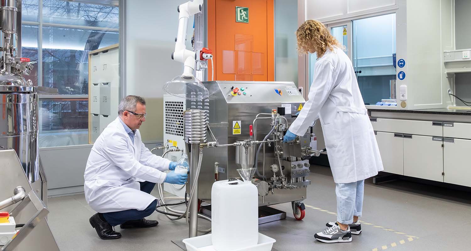
Our team's talent is backed by both national and international awards, which encourage us to continue improving as a company.
This evolution is not just a question of design
This evolution is not just a question of design
It is the natural result of the tireless search for the infinite possibilities of energy.

Our company
What we are and do has a clear purpose: to provide energy solutions that promote well-being.

Purpose and values
Our purpose is clear: to explore and discover all the possibilities that energy offers us so we can all advance.
Updated in March 2026